protPheMut is an online server tool for distinguishing and predicting inseparable single gene missense mutation multiphenotypic diseases. We will automatically calculate the phenotypic mutation characteristics and use the machine learning framework for model training and interpretation. The final results will be presented in a visual result. We will provide biological indicators that distinguish different disease phenotypes caused by single gene missense mutations and mutation score results to measure the biological significance of the current mutation in this phenotype.
1. Submit a query
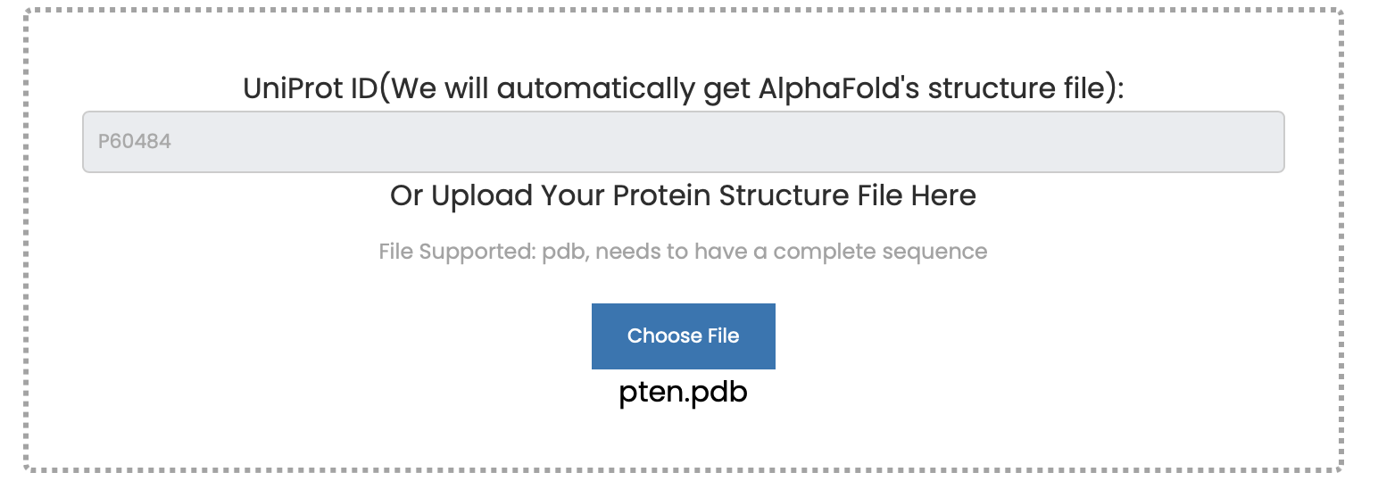
1.1 Prepare protein structure file
(1) The UniProt ID or your protein structure file. If you use UniProt ID we will automatically use the protein structure file from the AlphaFold Database(AlphaFold Database). You can type your UniProt ID at the the first text box of the Run page. If you use the UniProt ID, you cannot use your structure.
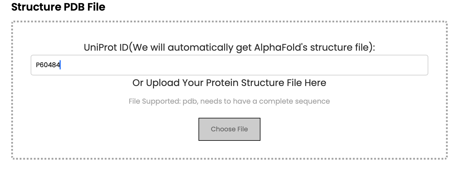
(2) Click "Choose File" button to submit your protein structure file.
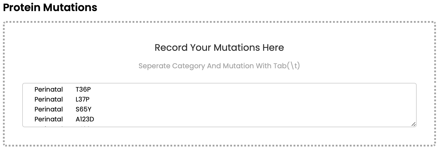
1.2 Phenotypes and mutations
You should provide mutation with labels(phenotypes), The phenotype is the first column and the mutation is the second column, which is segmented by \t. You can paste this information into the second input box.
1.3 Email
Provide your email at the third text box

1.4 Submit your query and run
(1) To prevent excessive pressure on the server, we now prohibit submitting one query while the server is running another. Check the Server Status at the top of the page. If IDLE indicates that the server is idle, data can be uploaded.

(2) Click the button to upload. If a prompt box pops up, the upload is successful.

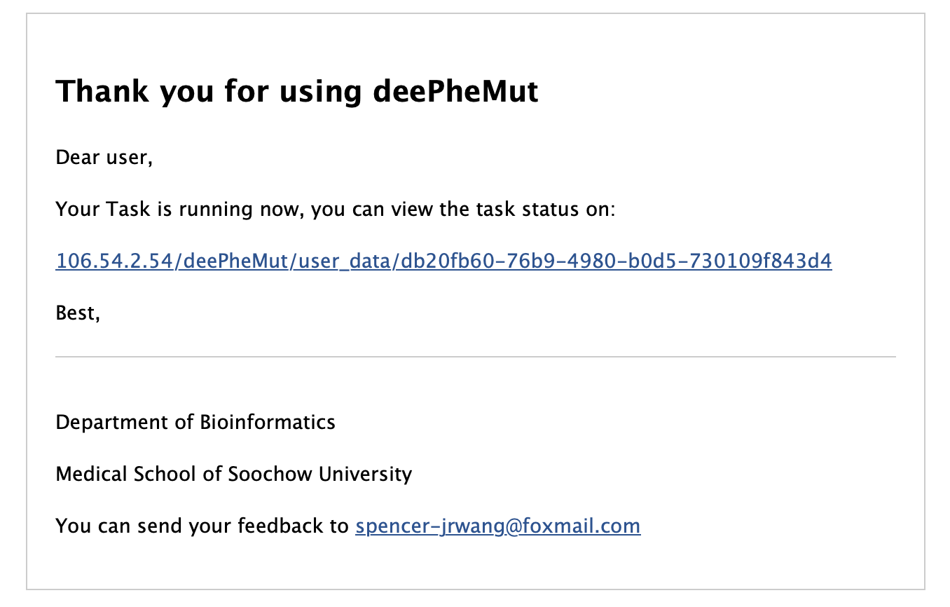
(3) Check your email, if you recieved an email like this, it means your data has passed inspection. You can also preview the task status by go to the link in the email.
(4) If you recieve an email "Oops! Something went wrong, please check your files", it means your data has not passed inspection. Please check your files.
2. Outcome preview
2.1 Preview webpage overview
(1) When the task is successfully completed, an email will be sent to your email. You can click the link in the email or refresh the original page to enter the preview webpage. The navigation bar on the right contains Summary, Feature Calculation, Model Construction, Model Explanation and PhenoScores respectively. Click the corresponding link to enter the corresponding location of the page.

(2) You can download it by clicking the Download button for each chart, and you can download all the data by clicking the download button at the end of the page.
2.2 Feature calculation
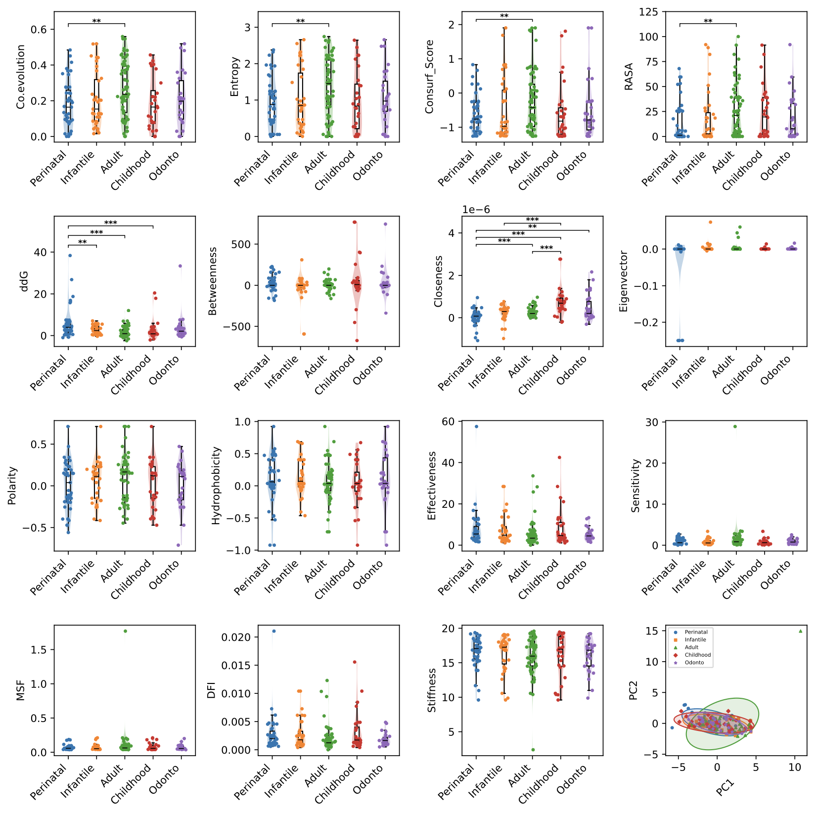
(1) Mutation parameter distribution plot and PCA plot, the first 15 images represent the performance of phenotypes in different parameters. When the sample size is greater than 30, t test in statistical test will be adopted, otherwise wilcoxon test will be used, where ** represents 0.01 < pvalue < 0.05, *** indicates pvalue < 0.001, the last picture shows the results of principal component analysis of mutations of different phenotypes. The distribution of principal component analysis shows the distribution of different phenotypic mutations on the first two principal components. The circle and points of different color represent the different phenotypes.
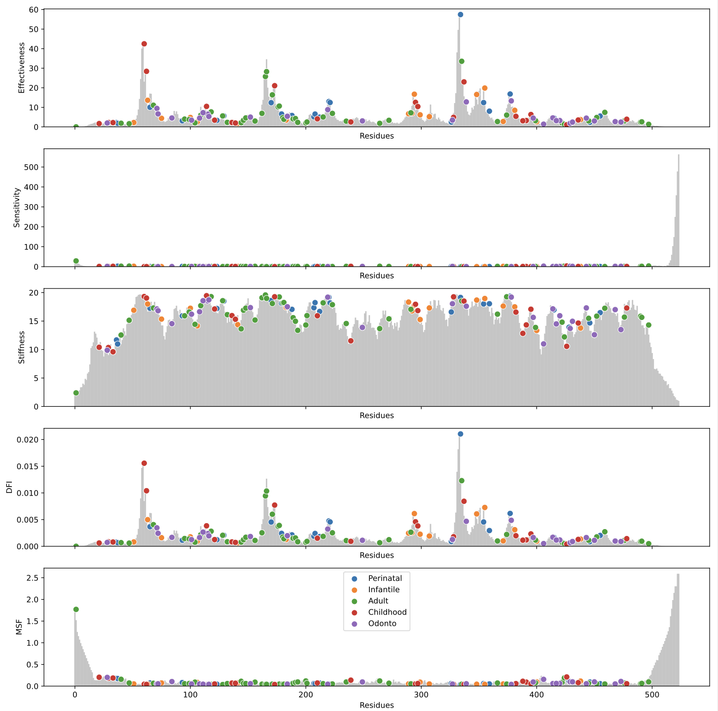
(2) Destribution of dynamic network based on ANM/ENM model, the plot shows the distribution of the dynamic features (Effectiveness, Sensitivity, Stiffness, DFI, MSF) by residue, the bar plot in grey color shows the dynamic features' disctribution in all residues, the scatter in different colors show the distribution of mutations of different mutations dynamic features. The greater of residue's effectiveness means the mutation in this position is less effective to break the origin graph's stucture, while the greater of residue's sensitivity means the mutation in this position is more effective to break the graph's origin structure.
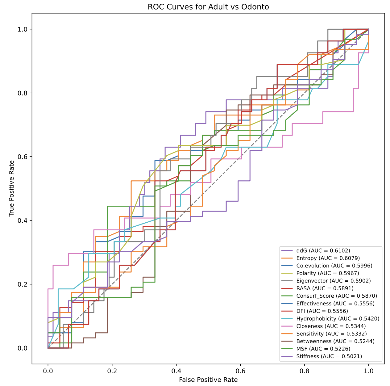
(3) The multi-phenotypes will first be divided into several binary classification, then the ROC plots is generated based on the origin parameter, the area under ROC curve(AUC) will be adjust to more than 0.5 by reversing the labels(0 or 1) of phenotypes. The greater AUC means the parameter can classify the phenotypes better by linear state.
2.3 Model construction
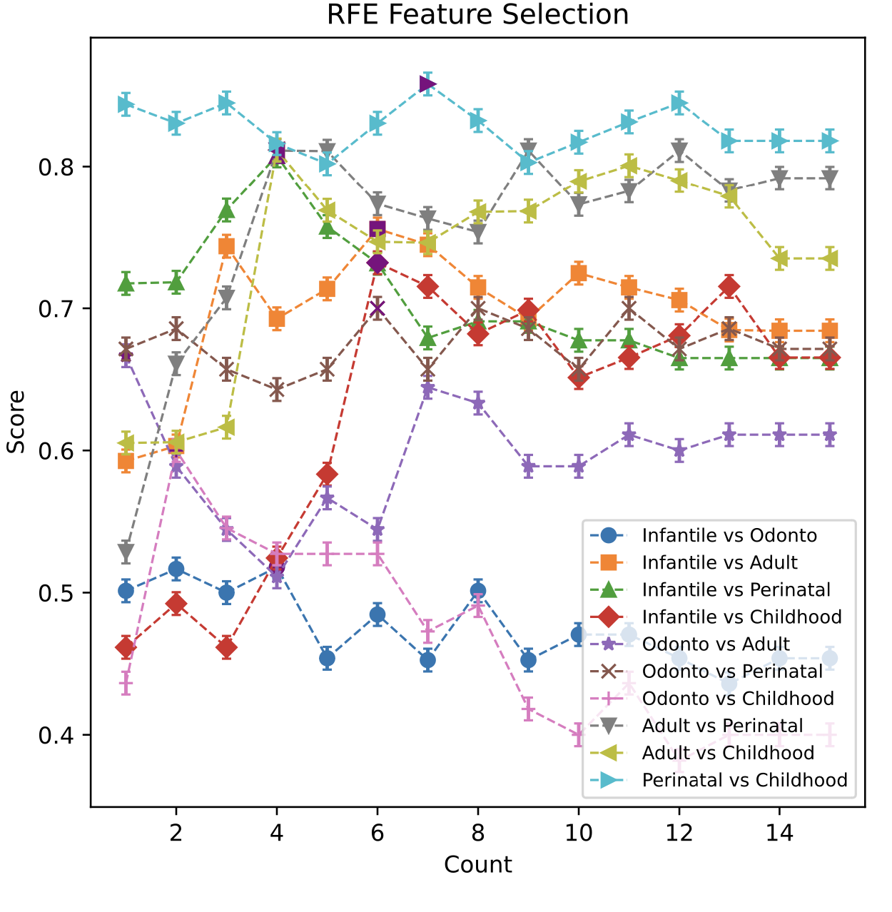
(1) Plot of rfe feature selection and average precision score this plot shows the process of rfe feature selection, rfe eliminates the features one by one, and gradually removes the features to the best combination of features. At the same time, the results obtained after each elimination of rfe are cross-validated by 5 straighted folds, and the average accuracy is obtained to evaluate the results of rfe feature elimination.
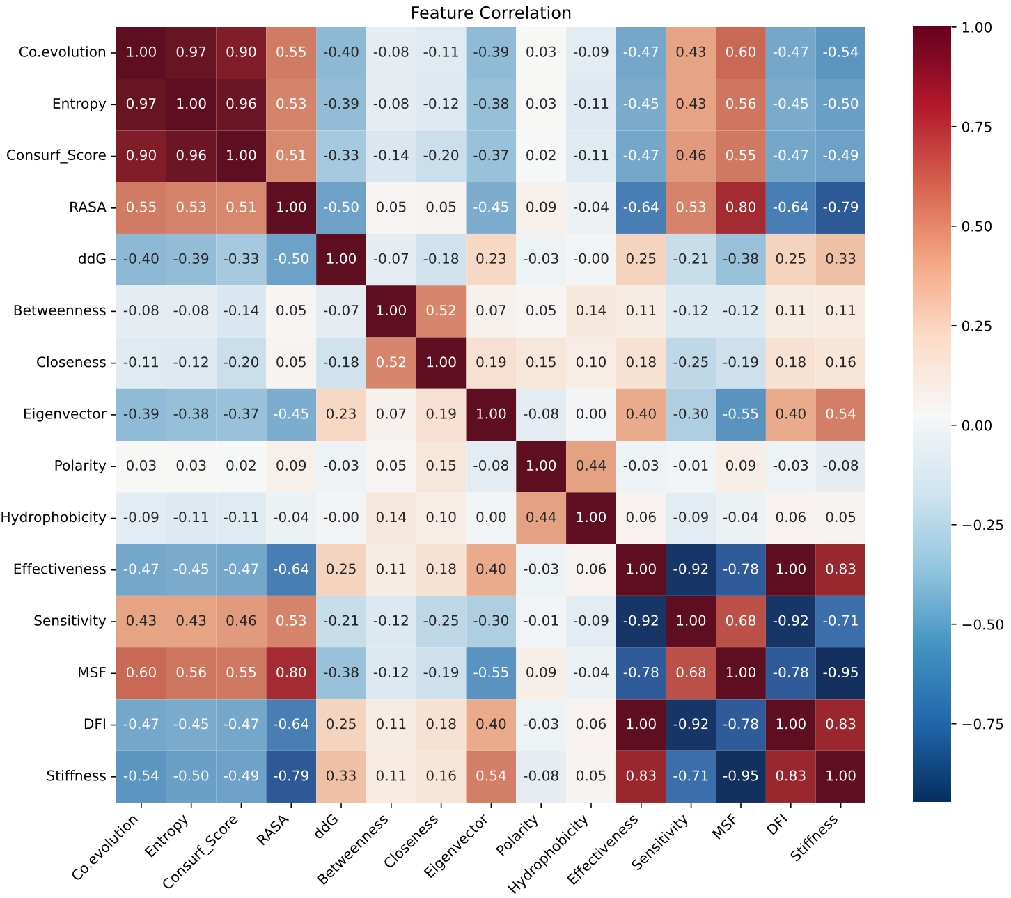
(2) Spearman correlation heatmap, this heatmap illustrates Spearman correlation coefficients computed between protein mutations and 15 selected features. Color intensity reflects the strength of correlation: bluer shades indicate positive correlations, while redder shades indicate negative correlations. Numeric values adjacent to the color bar denote the magnitude of correlation coefficients.
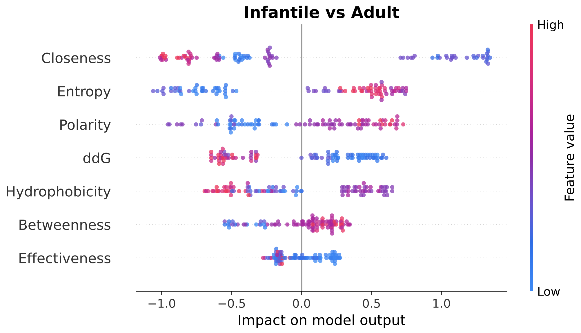
(3) The beeswarm plots for model explanation These plots shows the explanation of each classification using LightGBM model. The horizontal coordinate represents SHAP value(the SHapley Additive exPlanations) of the model, which are used to quantify the impact of each feature on the predicted result. The larger the value on the horizontal coordinate, the greater the positive influence of the feature on the prediction result. The smaller the value, the greater the negative influence of the feature on the prediction result. The ordinate represents the name of the feature, and the feature is ordered in order of importance, with the most important feature at the top of the graph. Each dot represents a sample, the color of the dot represents the size of the feature value, and the color gradients from blue (smaller feature value) to red (larger feature value). The distribution of points reflects the influence of different values of this feature on the model prediction, and the density of points represents the distribution of samples.
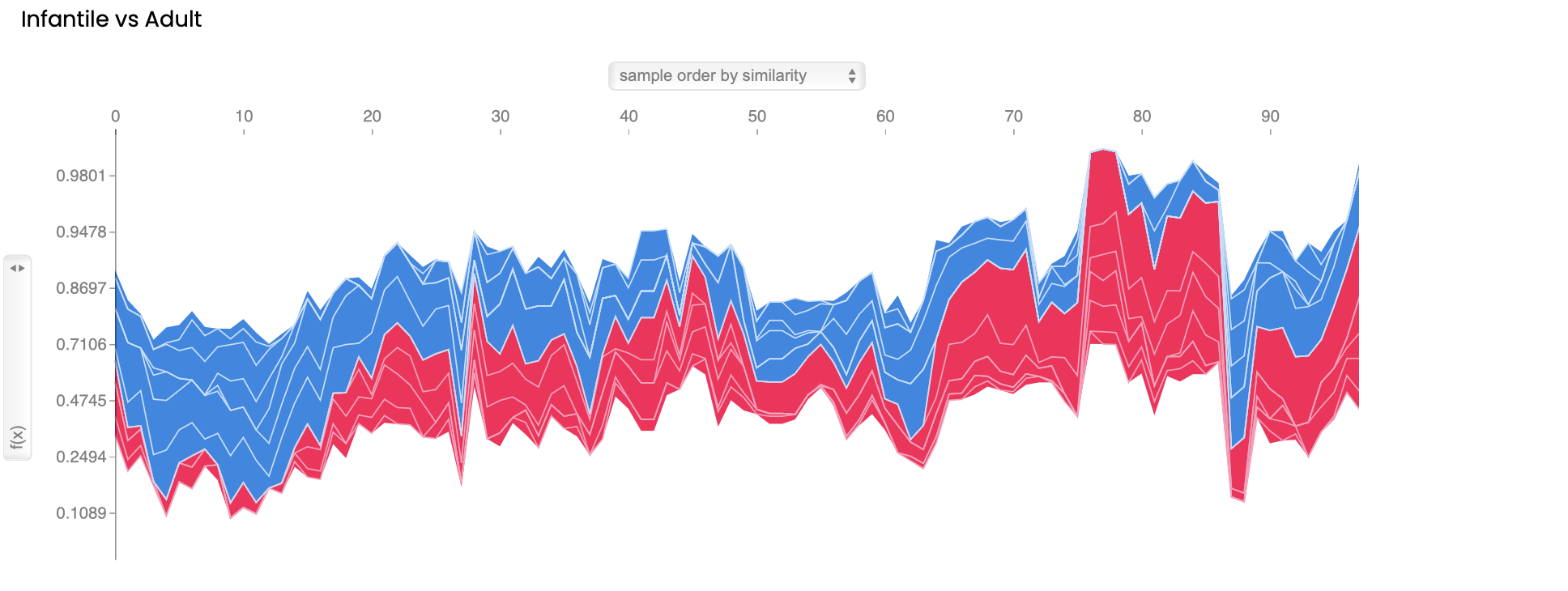
(3) Machine learning model explanation force plot, these force plots generated using SHAP visualizes the impact of features on the model's predictions. These plots show the parameters used by LightGBM to predict each mutation and the positive and negative contributions of each parameter to the model classification. Each feature's contribution to the prediction is represented by the length and direction(colors). Positive and negative contributions are indicated by pointing upwards(red) and downwards(blue), respectively.
2.4 PhenoScores
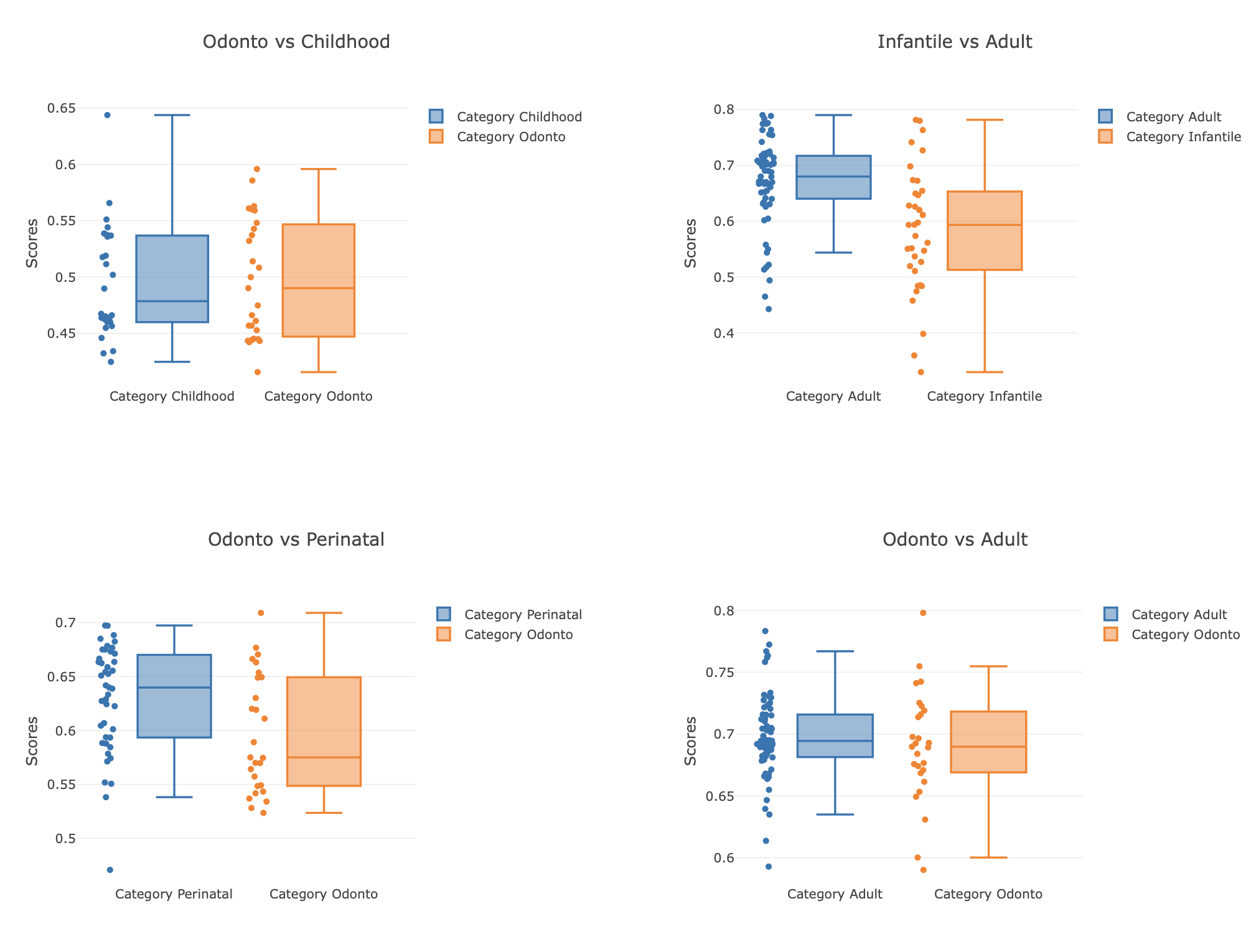
(1) Boxplot of PhenoScores, the box plot shows the distribution of phenoscores for groups A, B and C under labels 1 and 2. The horizontal axis represents the binary label, and the vertical axis represents the size of the PhenoScore. The PhenoScore is generated using 5-straighted k-fold cross validation predict. Different colors represent different groups: Group A is shown in blue and Group B is shown in orange. By comparing the boxplots of different colors, we can observe the differences in PhenoScore distribution of each group under different labels.
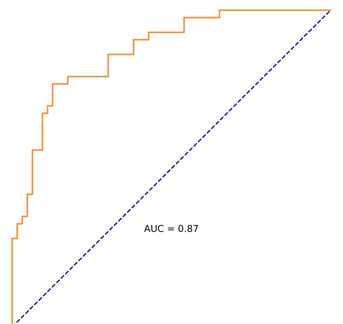
(2) ROC figure of PhenoScore, this figure presents the Receiver Operating Characteristic (ROC) curve for the PhenoScore model in a binary classification task. The x-axis represents the False Positive Rate (FPR), and the y-axis represents the True Positive Rate (TPR). The area under the curve (AUC) is 0.XX, indicating the model's overall performance in distinguishing between positive and negative samples. An AUC value close to 1 signifies high discriminative ability, whereas an AUC value of 0.5 indicates performance equivalent to random guessing.
2.5 Shortest path calculation
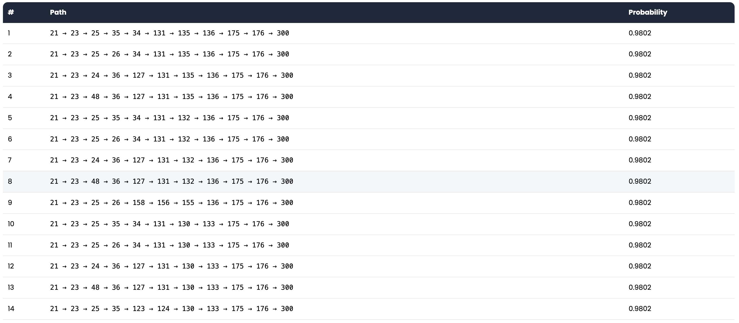
Calculate the shortest path between the mutation site and the functional site. The shortest path is calculated based on the original graph, and the path length is calculated based on the number of edges in the path. The change in the path length indicates the likelihood of the mutation affecting the protein's function. You can compare the path between the wild-type protein and the mutant protein. If the path length of the mutant protein is significantly longer/shorter than that of the wild-type protein, it suggests that the mutation may have a significant allosteric effect.
3. Contact us
3.1 Developer's information
(1) Network Protemics Lab, Department of Bioinformatics, Medical School of Soochow University
(2) Contact developer: Wang Jingran
3.2 Location